Portl is a conceptual university course planner and navigation app designed to address the fragmented nature of student tools. It consolidates platforms like Moodle, Sisu, and campus maps into a cohesive user experience. As a group project for our User Interface Design course, my team and I developed Figma prototypes aimed at enhancing the university experience for students while prioritizing usability, accessibility, and functionality.
Oct 2024-Dec 2024
Conceptual App
UI/UX Design
Lead UX/UI Designer

University students face challenges navigating their campus and managing academic tasks across multiple platforms. Many new students feel overwhelmed by fragmented tools, leading to missed assignment deadlines, frustration, and reduced engagement. This project sought to create a seamless and user-friendly solution to simplify and enhance the university experience.
Analyzing competitors like Moodle, Sisu, Tuudo and Google Calendar helped refine our scope and identify opportunities to improve functionality and usability.


We began the design process by identifying the challenges students face in managing their university life. Through qualitative interviews, analyzed using thematic analysis in ATLAS.ti software, we uncovered recurring frustrations. These included difficulty navigating campus, feeling overwhelmed by the need to check multiple platforms like Moodle and Sisu, and frequently missing deadlines due to ineffective notification systems. New students, in particular, struggled to locate classrooms and access key facilities, compounding their stress. These insights highlighted a clear need for a solution that streamlines tools, improves navigation, and simplifies the overall university experience.


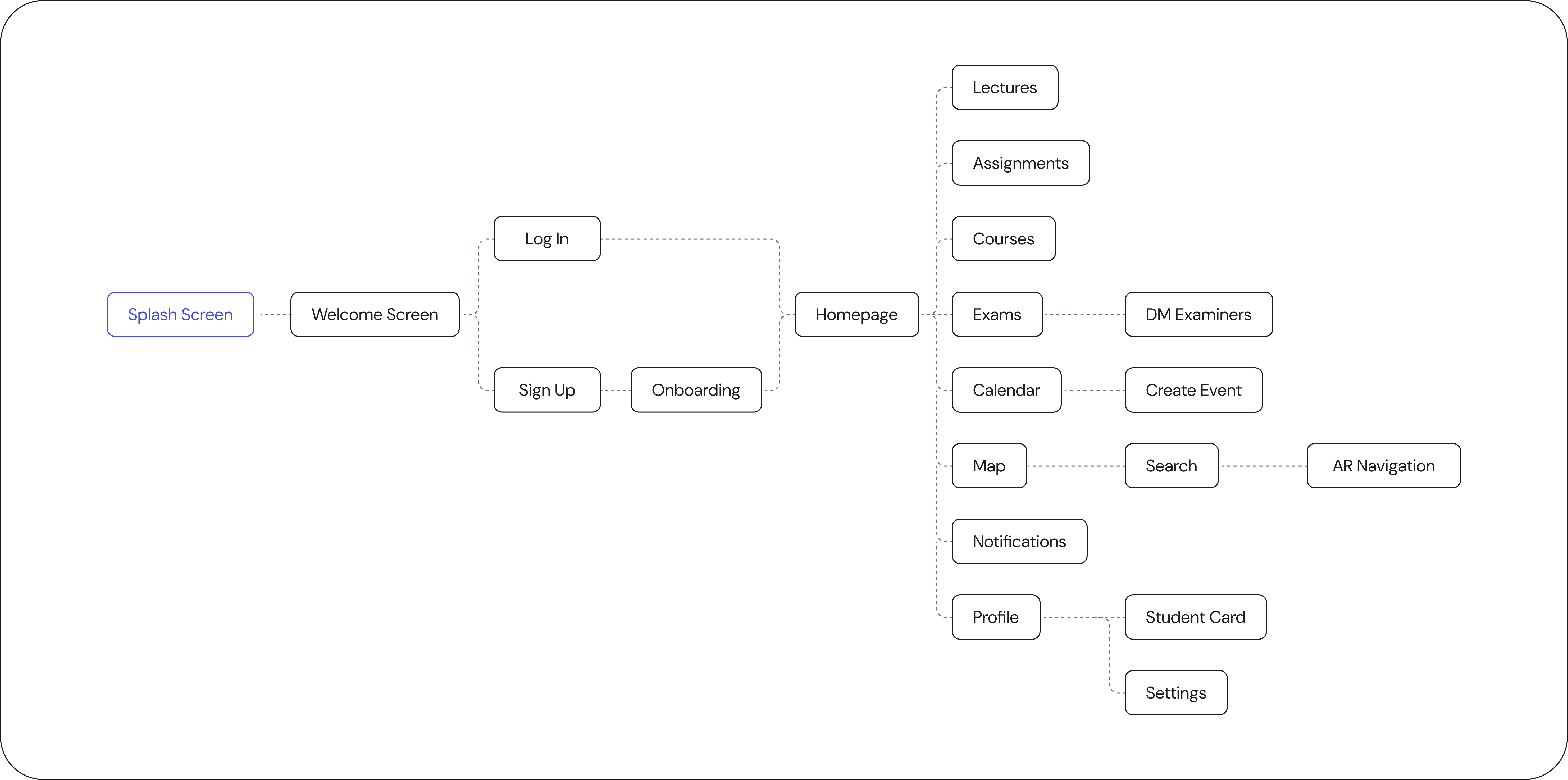
Our information architecture was shaped by the insights from user research and the ideas generated during the ideation phase. We focused on creating a logical structure that grouped essential features into intuitive sections, aiming to minimize cognitive load and ensure seamless navigation.

Wireframes were a critical step in translating our ideas into a tangible design. They provided a blueprint for the app’s structure, user flows, and core functionalities, allowing us to identify potential issues early. To encourage creativity, each team member independently created a version of the home screen wireframe. This approach brought diverse perspectives to the table, enabling us to combine the best elements into a cohesive design. Remaining screens were divided equally among the team. Regular feedback sessions ensured the wireframes evolved iteratively, aligning closely with user needs and the project’s goals. This phase streamlined our design process and set a solid foundation for prototyping.


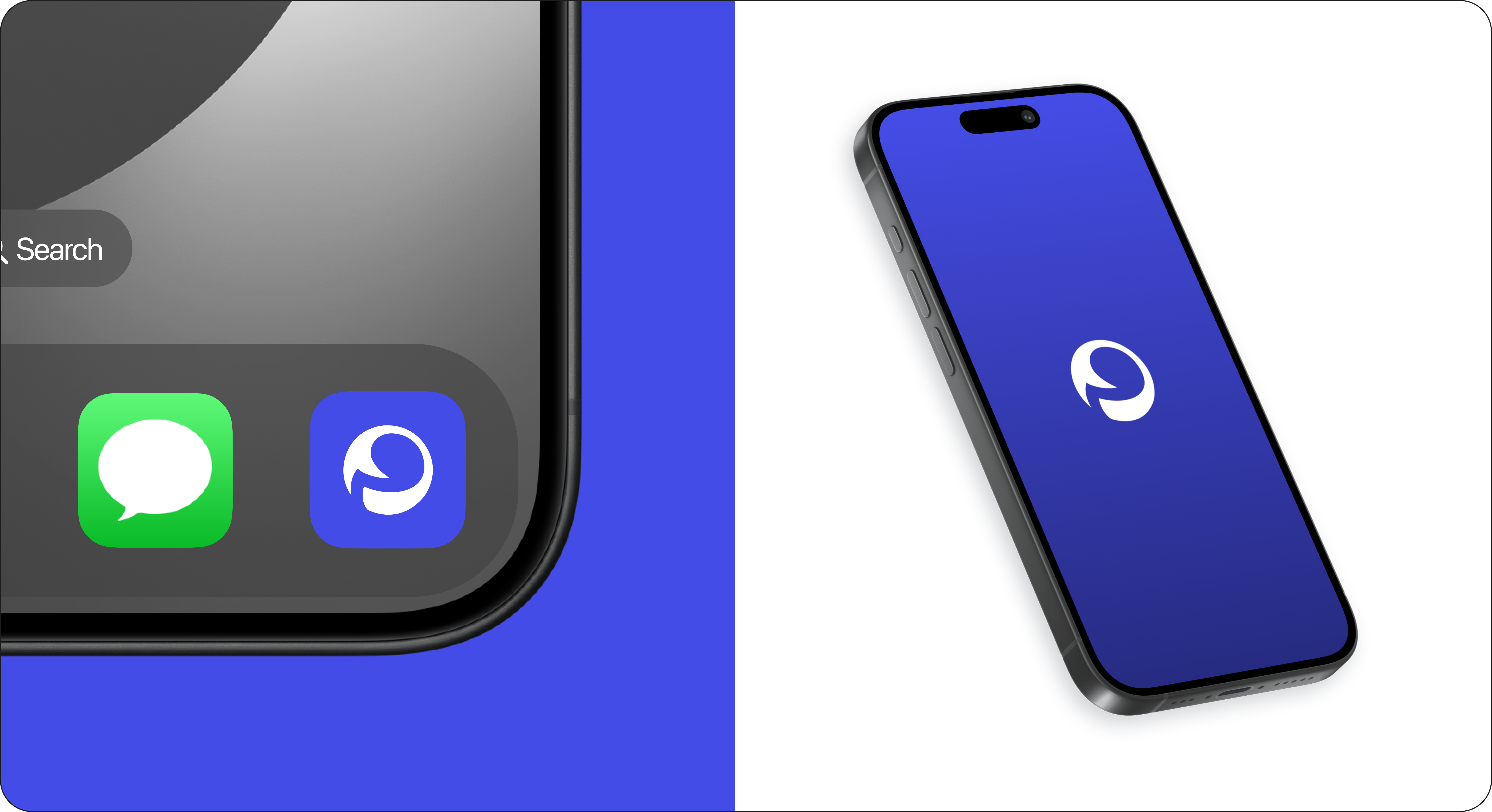
Portl’s logo is a thoughtfully crafted visual representation of the app's core purpose: simplifying academic life through education, navigation, and connectivity. Its circular shape symbolizes a "portal", echoing the app's role as a gateway to streamlined academic experiences. After 34 iterations, we struck a perfect balance between simplicity and meaning, resonating with the app’s mission to connect and support students effectively.

Next step was to create a cohesive design system to maintain consistency across the app, including typography, color palettes, and UI components tailored for accessibility and usability.

Portl’s visual design brought functionality and accessibility together in a way that felt effortless for students. Using a clean and cohesive aesthetic, we paired a calming purple palette with intuitive layouts to create a seamless experience. A key highlight was the AR-enhanced navigation, which provided real-time directions and overlays, making it easier for students to find classes, cafeterias, or other campus locations. This feature, alongside thoughtful UI elements, was met with positive feedback during testing, as students described the design as not only visually appealing but genuinely helpful in navigating their academic lives.


